My third grade memories are measured in marshmallows and coffee stirrers.
I have my teacher to thank for that. She walked in one day with a bag of mallows in one hand and a bag of coffee stirrers in the other, and said: “Whoever makes the strongest bridge gets to be line leader for the day.”
I wanted to win. I did my best. I lost (cue the violins). The jerk-faced kid who won built a structure that was long and geometric. My teacher then revealed to the class the lesson of this project, and why the victor’s bridge was so resilient: He used triangles.
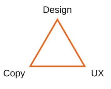
Triangles are regarded as one of the strongest shapes in engineering, which is why they’re consistently used in bridges and other buildings to promote structural integrity. This relationship between triangles and strength is a dynamic that also exists between copywriting and UX web design. As with building marshmallow bridges, harnessing the power of triangles in collaborative website design projects will ultimately produce the strongest possible result.
Before we get too deep, let’s take a step back and investigate what this relationship really looks like.
Website copywriting and UX design: A collaborative endeavor
Too often, each component of a website design is completed in a silo. It typically looks something like this, without much or any collaboration in between:
- The UX designer develops a site map and wireframes;
- The graphic designer uses these wireframes to inform page designs;
- The copywriter plugs in content where the design calls for it.
This process might produce a good website, but you want a great one.

Like all of the best advertisements, stellar website experiences come from a mixture of art, copy and insight. Therefore, common sense tells us that artists, copywriters and UX designers should work together on website projects from the onset.
Collaboration ensures several things when designing a website, and not least of these things is cross-functional ideation. With all three points of the triangle aligned every step of the way, your team will be able to determine not just if a functionality or design is possible, but also if it makes sense: for the user’s experience, for the design, and for the copywriting.
Think of your favorite storybook from your childhood. You loved it, kept coming back to it, and most of all, remembered it. Why? Because each sentence, each illustration, and each page-turn were so cohesive that it felt real.
So with a website: If any one of these components is neglected, the shape falls apart, and the integrity of the project disappears.
Effectively communicating through copywriting and UX web design.
When you’ve aligned your team, the challenge becomes communicating a unified message to the user. After all, the user should always be at the forefront of everything you do.

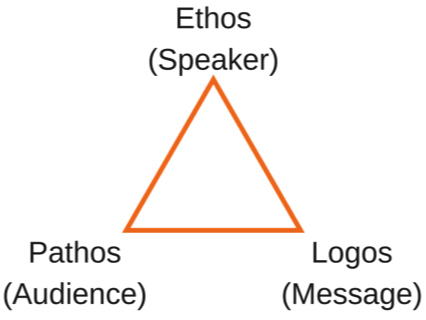
Way, way back in the 4th century B.C.E., Aristotle wrote a treatise titled, “Rhetoric.” In this treatise, Aristotle outlined the central facets of an effective argument. These facets would later become known as the (wait for it) rhetorical triangle.
While typically used to describe writing alone, Aristotle’s idea speaks more broadly to communication in general. This is where UX, copywriting and design come into play.
The goal of a website is to communicate with the user, teach them about your product or service, and eventually convince them to convert. Effectively, a website is an argument. The three prongs of Aristotle’s idea refer to the three components of a successful argument or story: Ethos, Pathos, and Logos. Hold these elements near and dear when designing a website – they will help you build trust with the user and lead them toward a conversion.
Let’s break them down and investigate how they correspond with UX, copywriting and design.
Ethos: an ethical appeal to the user. Successfully speaking to ethos means that you’re positioning yourself as an authority. Your website can communicate this by including expert testimony, choosing an industry-appropriate color palette, and designing a clean and clear user flow.
Pathos: an emotional appeal to the user. Successfully speaking to pathos means that you are striking emotional chords with your audience. You can achieve this by embedding relatable imagery, including poignant customer testimony, and writing with a friendly, personable tone.
Logos: a logical or rational appeal to the user. Achieving an appeal to pathos means that you’re taking the user on a rational and logical progression. Your UX and UX copy should guide the user through this journey. Your website copywriting in particular should taper after each step until it becomes almost invisible to the user, so he or she continues via intuition instead of explicit instruction.
Typically, the goal of your website should be to present an equilateral triangle, meaning you have a healthy balance of each appeal. But, as mentioned before, let your primary user inform your strategy and adjust where appropriate.
One final thing: In order to truly find harmony amongst your copywriters, UX and graphic designers, you all must sit arranged in a perfect triangle in regroups. It’s the only way to succeed*.
Do you have any success stories with this kind of collaboration? Let us know on Twitter @QuattroPhilly.
*Not really.
